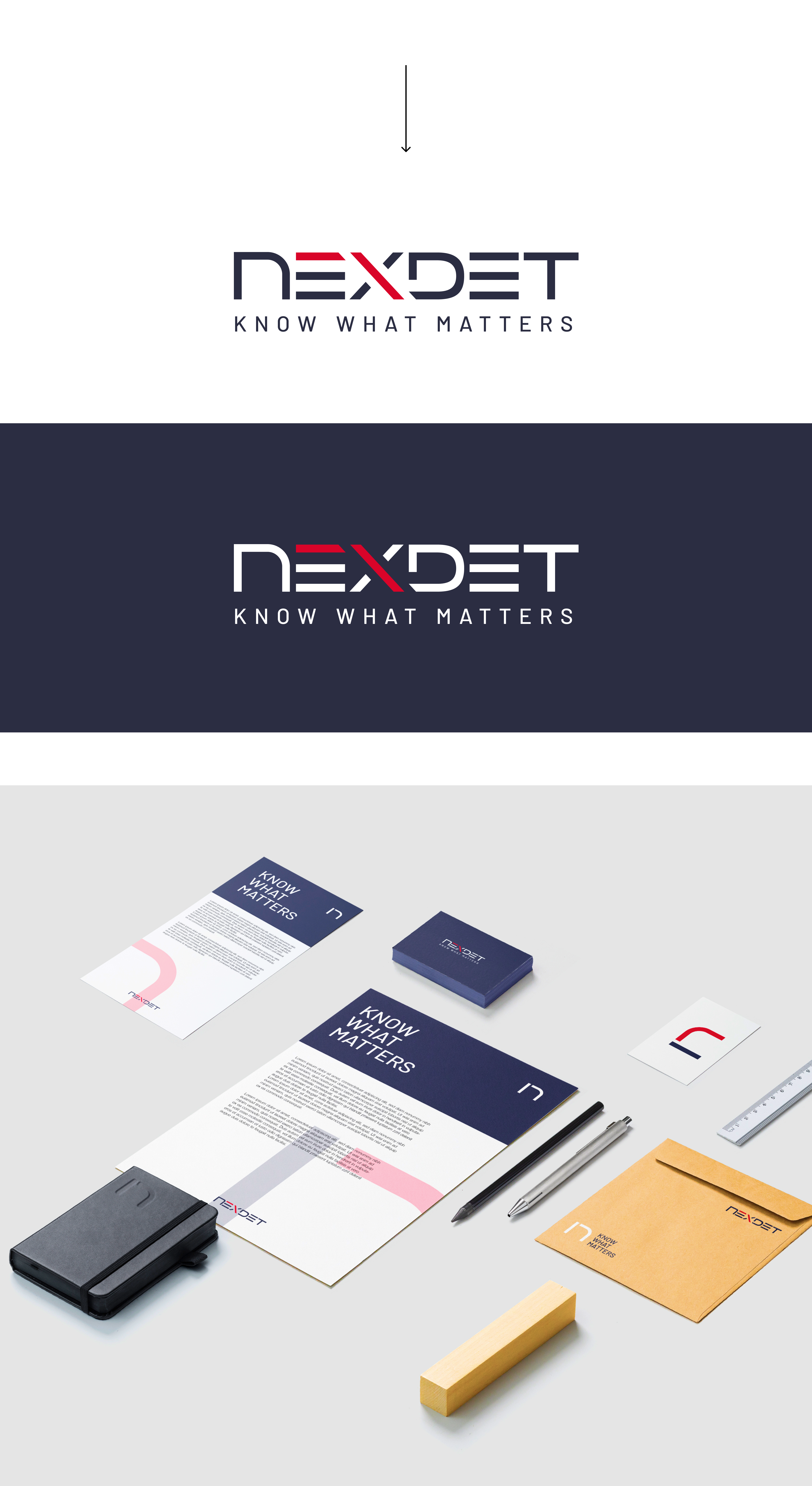
-Visual weight shifted to the left side, not giving visual harmony and centered balance.
-Text box of the 'E' too wide.
-Multiple different endings that do not provide graphic coherence (rounded, pointed, square, semi-round endings...).
-White spaces in the central rod of the 'X' are too fine.
-Slogan 'KNOW WHAT MATTERS' too bold, in this way it does not provide as much differential value with the naming.
thank you!